
Apple just pulled off something I haven’t seen them do in over a decade: they completely reimagined what their software looks like. At WWDC 2025, Apple unveiled the most sweeping software redesign in its history, introducing something called “Liquid Glass” that’s either going to make you fall in love with your Apple devices all over again, or have you scrambling for the settings to turn it off.
I’ve spent the last three days living with iOS 26 and its Liquid Glass design on my iPhone 15 Pro, and let me tell you – this isn’t just another minor update with a few visual tweaks. This is Apple saying “forget everything you thought you knew about our interface” and starting fresh. The question is: did they nail it, or did they fix something that wasn’t broken?
What Exactly Is Liquid Glass?
Before we dive into whether it’s good or bad, let’s talk about what Liquid Glass actually is. Apple calls it a design material that focuses on transparency, letting the content on your display shine through the controls. Think of it like looking through frosted glass – you can see what’s behind it, but it’s not distracting.
The basic idea is that instead of having solid, opaque interface elements that block your content, everything becomes semi-transparent. Your Control Center, notification panels, app backgrounds, even the status bar at the top of your screen – they all let your wallpaper and content show through while still being clearly readable.
Apple describes it as bringing “more focus to content and a new level of vitality while maintaining the familiarity of Apple’s software”. That’s corporate speak for “we made everything see-through but tried not to make it confusing.”
The transparency effect isn’t random either. Apple has carefully calibrated how much transparency each element gets. Critical controls like buttons you need to tap are less transparent than background elements. It’s like having different levels of frosted glass throughout your interface.
Living With Liquid Glass: The Good, The Bad, The Ugly
After using Liquid Glass for several days across my iPhone, iPad, and Mac, I have some strong opinions. Let’s start with what Apple got right.
The content-first approach is genuinely refreshing. When I’m browsing photos, reading articles, or watching videos, the interface elements fade into the background in a way that makes the content feel more immersive. It’s subtle, but there’s definitely a sense that your photos and apps are more the star of the show than the operating system itself.
The animation work is also stellar. When panels slide in and out, the transparency effects create this fluid, almost liquid-like movement that feels natural. It’s not just eye candy – the animations actually help you understand what’s happening spatially in the interface.
But here’s where things get complicated. If you’re having trouble with readability, there is a step that you can take to make things less transparent. The fact that Apple included this option tells you everything you need to know about how controversial this design is going to be.
I found myself squinting at certain interface elements, especially when I had busy wallpapers or bright content in the background. The Settings app, in particular, can be challenging to read when you have a colorful photo as your wallpaper. Text that was perfectly readable on a solid background becomes harder to parse when there’s visual noise bleeding through from behind.
The transparency also makes certain tasks feel less precise. When I’m trying to quickly navigate through settings or control panels, the visual clarity of the old solid backgrounds helped me move faster. With Liquid Glass, everything requires just a split second more cognitive processing to distinguish interface elements from content.
The Design Community Is Split
With such a significant update to the look and feel of Apple devices, it’s not surprising that design and UI professionals have things to say about the new Liquid Glass design language. And as you might expect, opinions are all over the map.
Some designers are praising Apple for taking a bold step forward and creating something that feels fresh in an industry that’s been playing it safe for years. The transparency effects do create a more modern, sophisticated look that makes other mobile interfaces feel dated by comparison.
But other designers are questioning whether Apple prioritized aesthetics over usability. The fundamental principle of good interface design is that form should follow function – things should look good, but more importantly, they should work well. Some argue that Liquid Glass tips that balance too far toward form.
I’ve been following design discussions on Twitter and in professional forums, and the sentiment seems to be roughly 60-40 in favor of the new design, but with significant reservations about accessibility and daily usability. Many designers love the concept but worry about execution.
What’s interesting is that Apple clearly anticipated this mixed reaction. The fact that they included robust customization options to dial back the transparency suggests they knew this would be polarizing. That’s either smart product management or a sign that they weren’t entirely confident in the design themselves.
Apple Intelligence: The Forgotten Stepchild
While everyone’s talking about Liquid Glass, Apple’s AI efforts continue to feel like an afterthought. Apple investors waiting for the company to make a big push in artificial intelligence didn’t have much reason for excitement at WWDC.
Don’t get me wrong – Apple Intelligence got some updates. New features include Live Translation, updates to visual intelligence, and enhancements to Image Playground and Genmoji. But compared to what Google, OpenAI, and Microsoft are shipping, Apple’s AI feels like it’s running in slow motion.
The most significant AI-related announcement was that Shortcuts can now tap into Apple Intelligence directly, and developers will be able to access Apple’s on-device large language model. This is actually pretty big for developers, but it’s not the kind of consumer-facing breakthrough that gets people excited about upgrading their devices.
What’s frustrating is that Apple Intelligence has the potential to be genuinely useful because of Apple’s focus on privacy and on-device processing. But the execution continues to lag behind the competition in ways that are hard to ignore.
I’ve been using the updated Siri with Apple Intelligence features, and while it’s better than the old Siri, it’s still nowhere near as capable as Google Assistant or even Amazon’s Alexa in many scenarios. The text generation features are fine but not spectacular. The image creation tools are fun but feel more like toys than productivity enhancers.
The Real-World Impact
Here’s what using these updates actually feels like in daily life. The Liquid Glass design makes certain activities more enjoyable – particularly anything involving photos, videos, or reading. The content-forward approach really does make media consumption feel more immersive.
But productivity tasks can be more challenging. I found myself taking longer to complete routine tasks like managing settings, organizing files, or quickly accessing system controls. The visual hierarchy isn’t as clear when everything is semi-transparent.
iPadOS 26 features improved app windowing, which is great news for iPad users who’ve been waiting for more Mac-like multitasking. The new windowing system works well with Liquid Glass – having multiple transparent windows creates an interesting layered effect that actually helps with spatial organization.
On the Mac, MacOS is getting a transparent upper menu bar, see-through lower apps bar and clear widgets. This works better on the Mac than on mobile devices, probably because Mac users are more accustomed to customizing their interface and have more control over their visual environment.
The Apple Intelligence updates, meanwhile, feel incremental. Live Translation is useful when it works, but it’s not consistently reliable enough to depend on. The visual intelligence features are impressive in demos but less practical in real-world scenarios.
The Accessibility Question
One aspect that’s not getting enough attention is accessibility. While Apple has always been good about accessibility features, Liquid Glass introduces new challenges for users with visual impairments or reading difficulties.
The reduced contrast that comes with transparency effects can make text harder to read for users with dyslexia or other reading challenges. Users with certain types of visual processing disorders might find the busy, layered visual environment more difficult to navigate.
Apple has included options to reduce transparency and increase contrast, but these settings don’t completely eliminate the issues. It’s something the company will need to continue refining based on user feedback.
Performance and Battery Life
Something Apple doesn’t talk about much is the performance impact of all these visual effects. Liquid Glass requires more graphics processing than the old solid interface elements, and I’ve noticed slightly reduced battery life on my iPhone since updating.
It’s not dramatic – maybe 10-15% less battery life throughout the day – but it’s noticeable. On older devices, the performance impact might be more significant. Apple says iOS 26 supports devices going back to the iPhone 12, but I suspect the experience won’t be as smooth on older hardware.
The transparency effects also mean your device’s GPU is working harder throughout the day, which could potentially impact long-term device performance and longevity. It’s too early to know for sure, but it’s something to keep in mind.
The Bigger Picture: Apple’s Design Philosophy
What’s really interesting about Liquid Glass is what it says about Apple’s current design philosophy. For years, Apple has been moving toward minimalism and simplicity. Liquid Glass represents a shift toward complexity and visual richness.
This might be a response to criticism that Apple’s software had become too bland and boring. The old iOS design was undeniably functional, but it wasn’t particularly exciting or distinctive. Every app looked similar, every interface felt the same.
Liquid Glass brings back some visual personality to Apple’s software. It’s more expressive, more dynamic, more visually interesting. Whether that’s better or worse depends entirely on your personal preferences and how you use your devices.
Who Should (And Shouldn’t) Update
If you’re someone who primarily uses your Apple devices for media consumption – photos, videos, reading, gaming – you’ll probably love Liquid Glass. The content-forward design really does make these activities more enjoyable.
If you’re a power user who spends a lot of time in productivity apps, system settings, and complex workflows, you might find the new design frustrating. The reduced visual clarity can slow down task completion and make certain workflows less efficient.
Business users and anyone who needs to use their devices in bright outdoor environments should be particularly cautious. The transparency effects can make screens harder to read in challenging lighting conditions.
Older users or anyone with vision challenges should definitely test the new design carefully and familiarize themselves with the accessibility options before fully committing to the update.
Insights
Apple’s Liquid Glass redesign is simultaneously the company’s most ambitious and most risky interface update in years. It’s beautiful, modern, and genuinely innovative. It’s also potentially problematic for certain users and use cases.
This represents the biggest UI updates to iOS, iPad OS and macOS in recent history, and with changes this significant, there are bound to be trade-offs. Apple has clearly prioritized visual appeal and content focus over some aspects of usability and accessibility.
The Apple Intelligence updates, meanwhile, continue to feel like Apple is playing catch-up rather than leading. The company that invented the modern smartphone is surprisingly behind in the AI race, and these updates don’t do much to close that gap.
My recommendation? If you’re curious about Liquid Glass, update one device first and live with it for a week before updating your other Apple devices. The design is love-it-or-hate-it, and you’ll know pretty quickly which camp you fall into.
As for Apple Intelligence, it’s fine but not compelling enough to be a major factor in your update decision. The real story here is Liquid Glass, and whether Apple has successfully reimagined what a modern mobile interface should look like, or created a beautiful solution to a problem that didn’t exist.
Time will tell, but for now, Apple has certainly made things more interesting.
Related Posts
Canon EOS C50: The Game-Changing Compact Cinema Camera That’s About to Shake Up Indie Filmmaking
After months of whispers, leaks, and anticipation, Canon has officially…
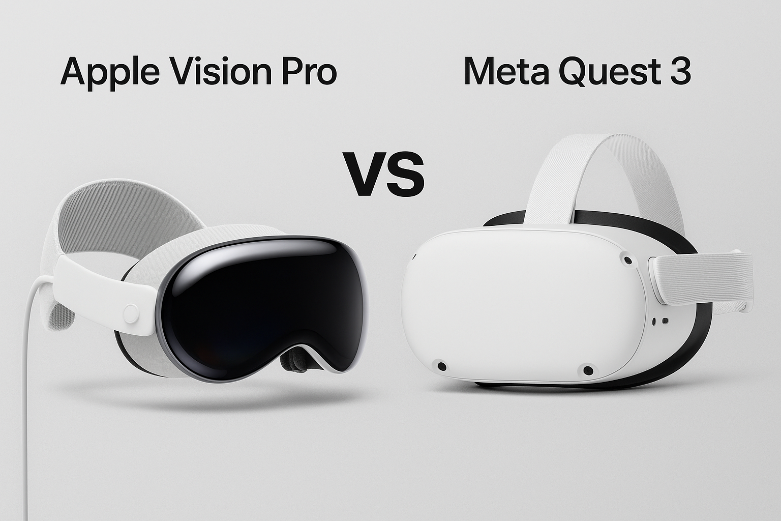
Apple Vision Pro vs. Meta Quest 3: A Deep Dive into AR/VR Camera Quality
As augmented reality (AR) and virtual reality (VR) technologies continue…
Google Pixel 9 Pro Fold Product Review
The Google Pixel 9 Pro Fold is the second-generation foldable…